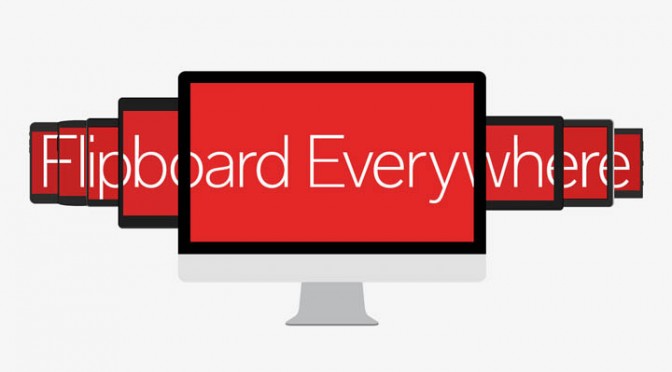
Flipboard Comes To Desktop
Flipboard had a mobile/tablet focus, until today. The desktop has a simpler, user friendly, appealing design.
Flipboard is by far my favorite mobile and tablet app but there had been a disconnect between the apps and the desktop experience.
The previous desktop version tried mimicking the app, which didn’t translate well to desktop browsers. Using a simple design and responsive web development, Flipboard created a new, but familiar user experience.
You can view all the feeds and magazines you follow in app, and since you’re signed in to your own account, any changes to your feed is reflected on your app.
All the Flipboard staples are there, but not completely. In app, you can share stories to almost any social network. The desktop version seems limited to Twitter and Facebook. That’s how it is now. I anticipate that will change as users adopt the desktop version.
This is the first time they’ve made a serious push for a desktop audience. Before the redesign, Flipboard.com tried to mimic a tablet’s user experience. It was not pretty. Images were pixled, navigation was a chore, sharing to magazines or social networks wasn’t ideal.
The new design changes that as it mimics Flipboard 3.0’s simplistic design.
This isn’t the first change targeted for desktop users. A few years ago, they released a “Flip It” plugin for Chrome and Firefox to help users add content to their Flipboard magazines.
It’s a welcome change. One that will surely kill my productivity at work. The only change I would make to either the desktop or mobile app is re-adding social shares while simultaneously flipping a story into a magazine.
That’s my two cents on the new Flipboard. What’s yours? Like it? Hate it?